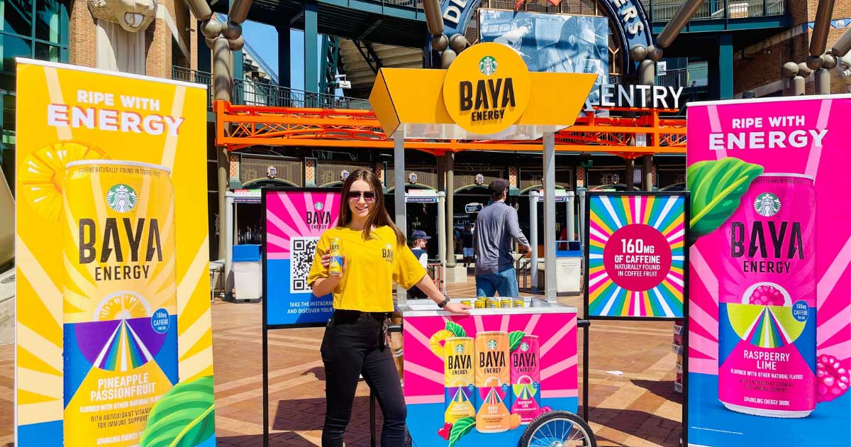
How the Right Colors can Help your Brand Stand Out
Did you know colors are the secret weapon for brands trying to make it big in the market? From catching the eye of potential customers to leaving a lasting impression, the right color choices can make all the difference in the success of your brand.
Color is an underestimated marketing tool that can influence consumer behavior and perception. The right color choices can create a strong emotional connection with your target audience and enhance your brand identity. At the same time, the wrong color choices can turn potential customers away and damage your brand’s reputation. It’s important that marketers understand the psychology behind color and its impact on consumer behavior.

Why it’s important
Color is an essential element of branding that can significantly impact how a brand is perceived by its target audience. The right color scheme can create an emotional connection with customers and foster brand recognition and loyalty. Colors can also evoke different emotions and feelings, which can influence purchasing decisions. By using colors consistently across all marketing materials, your brand can create a strong visual identity that resonates with your target audience and sets you apart from competitors. This makes choosing the right color scheme critical for building a successful brand that appeals to customers.
Rather than just creating an emotional connection and fostering brand recognition, color also plays a role in your brand’s overall design and aesthetic. The right color palette can make your brand’s logo, packaging, and other marketing materials stand out and be easily recognizable. Color creates a sense of consistency and unity across your brand’s various products and services. This can create a cohesive and memorable brand experience for customers.
Color is also used strategically to influence customer behavior, such as using red to create a sense of urgency in a call-to-action or using green to convey eco-friendliness and sustainability. It helps your brand communicate your values, personality, and messaging to your audience, and should be carefully chosen to fit your brand’s needs.

Tips
It can be challenging to decide on the RIGHT color scheme for your brand. The good news is, there are several tips you can use to help determine what will work best and capture your audience.
Understand your audience. Consider your target audience’s demographics, culture, and values. Certain colors may have different meanings and associations in different regions and cultures, and using the wrong color can lead to misinterpretation or even offense.
For example, in Western cultures, white is associated with purity, innocence, and cleanliness. However, in some Asian cultures, white is associated with mourning and death. Using white in marketing materials in those regions may be perceived as disrespectful or insensitive.
Consider your brand’s personality. Think about the emotions and values that you want your brand to convey. Are you a luxury brand that wants to project sophistication and exclusivity or a fun and playful brand that wants to appeal to young children? Luxury is indicated by black and gold tones while you should use bright colors to appeal to young children and their parents.
Look at your competition. Take a look at the color palettes of your competitors and make sure that your brand stands out while still fitting within the industry standards.
By analyzing the color palettes of your competitors, you can identify what colors are commonly used in your industry and find ways to differentiate your brand while still fitting within those standards. For example, if your competitors in the tech industry use a lot of blue and gray, you could consider using a brighter blue or incorporating a subtle pop of a different color to make your brand stand out while still fitting within the industry.
Think about color psychology. Different colors can evoke different emotions and behaviors in people. For example, red is often associated with passion, excitement, and urgency. It can increase heart rate and stimulate appetite, which is why it is often used in food and beverage branding. Blue, on the other hand, is often associated with calmness, trust, and reliability. It can have a soothing effect and is often used in financial and healthcare branding.
Test your colors. Once you have chosen a color palette, test it with your target audience to see how they respond. You can conduct surveys or focus groups to get feedback on your brand’s color scheme.

Remember that color is just one aspect of branding, and it should be used with other elements, such as messaging, tone of voice, and imagery, to create a cohesive and memorable brand experience.


